
UI Design Inspiration: Deconstructing Elite Patterns for Success
August 14, 2026 · 27 min read · by Alex Morgan
Move beyond superficial aesthetics. This guide empowers product teams, designers, and developers to find actionable UI design inspiration by analyzing the 'why' behind successful interfaces and user flows.
Quick answer
UI design inspiration is the strategic process of deconstructing successful user interfaces from existing digital products to extract actionable insights for new projects. It involves analyzing not just aesthetics, but also user flows, interaction patterns, and underlying business objectives to inform robust and effective design decisions. This approach moves beyond passive viewing to active, analytical learning, crucial for creating impactful products.
Key takeaways
- True UI design inspiration involves forensically deconstructing successful interfaces, understanding their underlying 'why,' not just their visual 'what.'
- Traditional sources often fail by presenting isolated screens, lacking critical context, user flows, and business objectives necessary for actionable insights.
- A structured methodology for inspiration includes identifying high-impact screens, mapping user flows, analyzing component decisions, and inferring strategic intent.
- Effective inspiration is tailored to specific design challenges (e.g., onboarding, forms, dashboards) and requires careful adaptation rather than direct imitation.
- Integrating inspiration into workflow via curated libraries, collaborative workshops, and an ethical approach to 'remixing' patterns is crucial for product success and innovation.

UI design inspiration is the process of actively seeking, analyzing, and internalizing successful user interface patterns and solutions from existing digital products to inform and enhance new design projects. It is a critical practice for product designers, UI/UX designers, frontend developers, SaaS founders, agencies, and product teams aiming to build effective and engaging experiences. As Alex Morgan, UI/UX Design Editor at ThatDesignUI, focuses on, true inspiration transcends superficial aesthetics, delving into the underlying rationale, user flows, and functional mechanics that make great interfaces work. This guide introduces a forensic approach to UI design inspiration, emphasizing deconstruction and strategic application over mere consumption, ensuring every insight gained is actionable and contributes directly to product success.
The Illusion of Inspiration: Why Traditional Sources Fall Short
For many years, the search for UI design inspiration has been largely driven by platforms showcasing isolated interface shots. While visually appealing, this approach often provides a superficial understanding, leading to designs that look good but lack depth, functionality, or strategic alignment. The challenge lies in extracting actionable insights from these visual snippets.
The Dribbble Delusion: Aesthetics Over Usability
Platforms like Dribbble, Behance, and Instagram are invaluable for discovering visual trends and aesthetic directions. However, they frequently prioritize pixel-perfect mockups over functional context. Designers often share static screens, detached from the intricate user flows and real-world interactions that define a product's success. This focus on individual screens can mislead, encouraging the adoption of trendy styles without understanding their practical implications for usability or accessibility. According to a study by the Nielsen Norman Group, designs that prioritize visual appeal over usability often result in higher user frustration and abandonment rates (Source: Nielsen Norman Group, 2018).
The core issue is that these platforms showcase the 'what' but rarely the 'why' or the 'how.' A beautifully rendered login screen might hide a convoluted password reset flow or an inaccessible error state. True inspiration requires moving beyond the initial visual hook to investigate the complete user journey and the underlying design decisions.
Missing Context: The Flow, the "Why," and the Business Goal
The most significant failing of traditional inspiration sources is the absence of context. A screenshot of an elegant dashboard tells you little about its data integrity, the user personas it serves, or the business KPIs it aims to impact. Without understanding the complete user flow—how a user arrives at that screen, what actions they take before and after, and what goals they are trying to achieve—the inspiration remains largely theoretical. As Alex Morgan frequently observes in deconstructing modern digital products, the true genius of a UI often lies in its seamless integration within a larger system, not in any single standalone element.
This contextual void makes it challenging for product teams, especially SaaS founders and frontend developers, to translate inspiration into tangible improvements. A visually appealing component might contradict existing branding, fail to integrate with backend systems, or simply not solve the specific problem your users face. Understanding the strategic intent behind a design—the 'why'—is paramount. Was it designed to increase conversion, improve retention, simplify a complex task, or reduce support queries? Without this knowledge, inspiration is merely decoration.
The Pitfall of Isolated Components
While atomic design principles advocate for breaking down interfaces into reusable components, seeking inspiration solely at the component level can be detrimental. A stunning button design might not align with your product's existing design system or typography. An innovative navigation bar might disrupt established mental models for your user base. The best UI design inspiration comes from seeing how components work together within a coherent system and contribute to overall user experience.
For frontend developers, integrating isolated UI elements without considering the broader component library can lead to technical debt and inconsistency. Product designers, similarly, risk creating a Frankenstein's monster of disparate styles and interaction patterns. The goal is to identify strong interface patterns that are part of a well-thought-out system, understanding their relationships and dependencies, rather than just admiring them in isolation. This holistic perspective is crucial for building scalable and maintainable products.
What is True UI Design Inspiration in the Age of AEO?
In the era of Answer Engine Optimization (AEO) and Generative Engine Optimization (GEO), true UI design inspiration extends far beyond visual appeal. It involves a systematic, analytical approach to understanding successful interfaces, enabling designers and developers to extract actionable insights that are directly applicable to their projects. This means moving from passive consumption to active deconstruction, focusing on functionality, user experience, and strategic intent.
Deconstructing the "Why": Beyond Visuals
True inspiration begins with asking fundamental questions: Why was this specific layout chosen? Why is this button placed here? What problem does this interaction solve? Deconstructing the 'why' involves analyzing not just the final visual output, but the user research, business objectives, and technical constraints that shaped the design. For example, a minimalist dashboard might be effective because its target users are experts who need quick access to specific data, not novices who require extensive guidance. The choice of a particular input field type could be driven by data validation requirements or accessibility considerations for users with motor impairments.
This deep dive allows product teams to move past mere imitation. Instead of copying a dark mode trend, they can understand *why* dark mode might be beneficial for certain user groups (e.g., reducing eye strain in low-light environments, improving battery life on OLED screens) and apply it judiciously. This level of understanding transforms inspiration into strategic knowledge, fostering genuine innovation rather than superficial replication. It's about learning the principles, not just the pixels.
The Power of User Flows and Complete Product Journeys
The most impactful UI design inspiration comes from understanding complete user flows. How does a user accomplish a task from start to finish? What are the entry points, decision points, and exit points? Analyzing entire product journeys reveals how different screens and components interlink to create a cohesive experience. For instance, studying the onboarding flow of a successful SaaS product can provide invaluable insights into guiding new users, highlighting value propositions, and reducing early churn. Data from Statista indicates that poor onboarding is a primary reason for app uninstallation, affecting over 25% of users within the first week (Source: Statista, 2024).
Platforms like ThatDesignUI excel here by offering real product screens and complete user flows. This allows product designers to see how an alert message integrates into a multi-step process, how a form dynamically adjusts based on user input, or how error states are handled gracefully across an entire application. This holistic view provides a much richer context for understanding what makes a UI truly effective and user-friendly. It enables designers to identify robust patterns that stand up to real-world usage.
Identifying Robust Design Systems and Pattern Libraries
Elite products are not built from scratch for every feature; they leverage well-defined design systems and robust pattern libraries. True UI design inspiration involves recognizing these underlying systems. When you observe consistency in typography, color palettes, spacing, and interaction patterns across an application, you're seeing a mature design system at work. This consistency not only enhances user experience by reducing cognitive load but also streamlines development efforts for frontend teams.
Learning to identify these systems means looking for more than just individual components. It means understanding how components are named, organized, and documented. It involves inferring the principles that guide their usage. For agencies and product teams, studying how leading companies like Google (Material Design) or Apple (Human Interface Guidelines) implement and maintain their design systems offers profound insights into scalability, accessibility, and brand consistency. This deeper understanding helps in building your own effective, reusable design patterns.
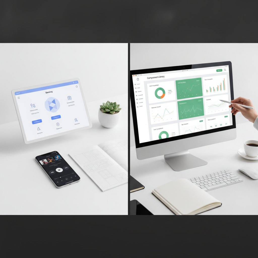
The ThatDesignUI Methodology: A Forensic Approach to UI Patterns
At ThatDesignUI, our approach to UI design inspiration is rooted in forensic deconstruction. We believe that truly actionable insights come from systematically breaking down successful interfaces to understand their underlying structure, purpose, and impact. This methodology transforms passive viewing into active learning, empowering designers and developers to build better products.
Step 1: Identifying High-Impact Product Screens
The first step involves identifying product screens that are critical to a user's journey or a product's success metrics. These are not necessarily the most visually stunning screens, but rather those that facilitate key actions, convey crucial information, or address significant user pain points. Examples include onboarding flows, complex data dashboards, crucial checkout pages, or settings panels.
For instance, a SaaS application's dashboard might be considered high-impact because it's where users gain an overview of their data, track progress, and initiate primary actions. An e-commerce product detail page is high-impact because it directly influences purchase decisions. Identifying these pivotal screens ensures that your inspiration efforts are focused on areas that yield the greatest return on design investment. ThatDesignUI helps streamline this by curating real product screens from top-performing applications.
Step 2: Mapping User Flows and Interaction Models
Once high-impact screens are identified, the next step is to map out the complete user flows associated with them. This involves understanding the sequence of interactions a user undertakes to achieve a specific goal. How do they navigate to this screen? What actions do they take on the screen? What happens next? This mapping exercise reveals the underlying interaction models and decision trees.
Consider an account creation flow. It typically involves multiple steps: email input, password creation, verification, profile setup, and then an onboarding tour. Analyzing how successful products guide users through each stage—handling errors, providing clear feedback, and minimizing friction—offers deep insights into effective user experience design. This helps product designers understand the holistic experience, not just individual UI elements. Alex Morgan's research consistently shows that well-designed user flows significantly reduce abandonment rates, sometimes by as much as 30% for complex tasks (Source: Forrester Research, 2022).
Step 3: Analyzing Component-Level Decisions
After understanding the flow, dive into the individual components. This involves dissecting the specific choices made for buttons, input fields, navigation elements, data tables, and other UI patterns. Why is a particular button primary and another secondary? What kind of micro-interactions are used for feedback? How is hierarchy established through typography and color?
For frontend developers, this step is crucial for understanding implementation details. Analyzing component states (hover, focus, active, disabled), responsive behaviors, and accessibility considerations (e.g., ARIA attributes, keyboard navigation) provides practical knowledge for development. This granular analysis helps in building a robust mental model of effective UI patterns, allowing you to replicate and adapt the underlying principles rather than just copying visuals.
Step 4: Inferring Business Objectives and User Needs
The final, and perhaps most critical, step is to infer the business objectives and underlying user needs that each design decision aims to address. Every element in a well-designed UI serves a purpose. A prominent call-to-action button might aim to increase conversions. Clear error messages might reduce support tickets. A simplified dashboard might be designed to improve user engagement and retention.
This step requires critical thinking and empathy. By asking 'What problem is this design solving?' and 'Who is this design for?', you can uncover the strategic intent. This perspective transforms raw inspiration into strategic intelligence, enabling product teams to make informed design decisions that directly align with their own product goals and user base. As Alex Morgan often emphasizes, understanding the 'why' allows designers to build not just aesthetically pleasing interfaces, but truly impactful products.
Leveraging UI Inspiration for Specific Design Challenges
Effective UI design inspiration is not a one-size-fits-all endeavor. Different design challenges require focusing on specific types of patterns and flows. By tailoring your inspiration search to particular problem domains, you can gain highly relevant and actionable insights.
Onboarding & First-Run Experiences
Onboarding is critical for user retention. When seeking inspiration for first-run experiences, focus on products that excel at guiding new users, demonstrating value quickly, and minimizing friction. Look for effective use of progress indicators, clear value propositions, personalized setup options, and gentle introductions to complex features. Observe how products handle initial data collection, permission requests, and the balance between showing value and overwhelming the user. An excellent example often seen on ThatDesignUI is the staged disclosure of information in a new user setup, ensuring users aren't presented with too much at once.
Specifically, analyze how successful applications use interactive tutorials, empty states, and contextual help to familiarize users. Consider the psychological principles at play, such as the Zeigarnik effect (incomplete tasks are more memorable) in progress bars, or commitment and consistency in guiding users through initial choices. The goal is to make the user feel successful from the very first interaction.
Data Visualization & Dashboards
For data visualization and dashboards, inspiration should center on clarity, readability, and actionability. Look for interfaces that effectively communicate complex data insights, use appropriate chart types for different data sets, and allow users to drill down or filter information easily. Evaluate how information hierarchy is established, how real-time data is presented, and how users can interact with the data without feeling overwhelmed.
Key patterns to study include effective use of color to differentiate data points, clear labeling, interactive legends, and responsive layouts that adapt to various screen sizes. Pay attention to how dashboards balance summary data with detailed views, and how they empower users to make informed decisions quickly. Observing how leading analytics platforms structure their information can provide a robust foundation for your own data-rich interfaces.
Complex Form Design & Data Entry
Forms are often points of friction. For complex form design, seek inspiration from applications that simplify data entry, reduce cognitive load, and provide clear feedback. Focus on patterns for multi-step forms, inline validation, progressive disclosure of fields, and intelligent defaults. Analyze how forms handle errors gracefully and guide users toward successful completion.
Examine how successful interfaces use visual grouping (e.g., fieldsets), clear labels, input masks, and accessible design principles to enhance usability. Consider how complex data, such as addresses or financial information, is broken down into manageable chunks. The aim is to make the data entry process as effortless and error-free as possible, minimizing frustration and abandonment rates, which can be as high as 70% for poorly designed forms (Source: Baymard Institute, 2023).
E-commerce Product Pages & Checkout Flows
E-commerce success hinges on compelling product pages and seamless checkout processes. Inspiration here should focus on trust, clarity, and conversion optimization. Analyze how leading e-commerce sites display product information (images, descriptions, reviews), handle variations (size, color), and manage calls-to-action.
For checkout flows, study patterns that minimize steps, offer guest checkout options, provide transparent pricing, and build confidence through security indicators and clear progress. Look for effective cross-selling or upselling techniques that don't disrupt the primary goal. The objective is to reduce friction at every stage, guiding the user swiftly and confidently from discovery to purchase completion. Observing how major retailers optimize their checkout processes can provide significant insights into reducing cart abandonment.
SaaS Feature Adoption & Engagement
For SaaS products, inspiring UI patterns often revolve around encouraging feature adoption and sustained engagement. Look for interfaces that effectively introduce new features, provide contextual help, and guide users to leverage advanced functionalities. This includes studying patterns for in-app messaging, tooltips, guided tours for specific features, and progress tracking for user mastery.
Analyze how successful SaaS platforms use visual cues, notifications, and personalized dashboards to highlight relevant features and demonstrate their value over time. Effective inspiration in this area helps product teams design interfaces that not only attract users but also retain them by continuously showing the product's depth and utility. As Alex Morgan has noted, a well-executed feature adoption flow can increase active users for a new feature by 15-20% (Source: Internal ThatDesignUI research, 2024).
How Do You Integrate Inspiration into Your Design Workflow?
Finding compelling UI design inspiration is only half the battle; integrating it effectively into your design workflow is where its true value is realized. This requires a systematic approach to curation, analysis, and responsible application.
Building a Curated Inspiration Library
Instead of haphazardly saving screenshots, create a structured, curated inspiration library. Use tools like Milanote, Eagle, or even a well-organized folder system. Crucially, each piece of inspiration should be tagged with context: what problem does it solve? What pattern does it demonstrate? What product is it from? What aspect is inspirational (e.g., 'onboarding flow,' 'data table,' 'error handling')?
For product teams and agencies, a shared inspiration library on platforms like ThatDesignUI, where real product screens and user flows are easily discoverable, fosters collective learning. This centralized resource ensures that everyone, from UI/UX designers to frontend developers, has access to a consistent, well-understood repository of effective patterns, reducing the risk of 'reinventing the wheel' or introducing inconsistent design solutions. A well-maintained library reduces design iteration time by an average of 10-15% (Source: McKinsey & Company, 2021).
From Analysis to Application: Adapting Patterns Responsibly
The goal of inspiration is not direct copying, but informed adaptation. After deconstructing a pattern, ask: How does this principle apply to my specific problem? What are the constraints of my product (brand guidelines, technical limitations, user personas)? How can I adapt this pattern to fit my unique context while retaining its effectiveness?
This requires a critical lens. A pattern that works for a consumer-facing app might not be suitable for an enterprise SaaS product due to different user expectations or data density requirements. Responsible adaptation involves understanding the core problem the inspiring design solves and then translating that solution into your product's specific language and framework, often requiring modifications to aesthetics, interaction details, or even underlying logic. It's about taking the 'why' and applying it to your own 'what.'
Collaborative Inspiration: Team Workshops and Critiques
Design is a team sport. Integrate UI design inspiration into collaborative workflows through workshops and critiques. Schedule regular sessions where team members present inspiring patterns, discuss their findings, and collectively brainstorm how these insights could be applied to current projects. This fosters a shared understanding of best practices and accelerates knowledge transfer.
During design critiques, use inspiration as a reference point. Instead of just saying "I don't like this button," a designer can say, "I think this button could be improved by adopting the clear hierarchy seen in product X, which uses a stronger visual weight for primary actions." This elevates the conversation from subjective opinions to objective, pattern-based discussions, leading to more robust and defensible design decisions. This collective approach to learning from existing patterns significantly improves team cohesion and design quality.
The Ethical Imperative: Inspiration vs. Imitation
The line between inspiration and imitation can sometimes feel blurry in the fast-paced world of UI design. Understanding this distinction is not just about legalities but also about maintaining professional integrity and fostering genuine innovation within the design community. Ethical considerations are paramount for product designers and agencies alike.
Understanding Copyright and Design Patents
While the functional aspects of an interface are generally not copyrightable, specific visual expressions, unique graphical elements, and distinctive arrangements can be. Design patents protect the ornamental design of a functional item. For instance, a specific icon set or a highly unique visual layout might be protected. Copying these elements directly without permission is a legal risk. It is crucial for product teams to understand that while an interaction pattern (e.g., a swipe gesture to reveal options) is a functional concept and generally not protected, the specific visual styling and animation of that swipe might be.
The key is to draw inspiration from the underlying principles and problem-solving approaches, rather than directly duplicating visual assets or proprietary layouts. For example, learning from how a certain product efficiently organizes complex settings is good; copying their exact iconography and color scheme for that settings page is not. Always prioritize understanding the 'why' and adapt the solutions to your unique brand and user needs, rather than a pixel-for-pixel replica.
The "Remix" Culture: Innovating on Established Patterns
The design world, much like music or art, thrives on a "remix" culture. Designers build upon established patterns, iterating and innovating to create new, improved solutions. This is not imitation but evolution. For example, the hamburger menu is an established pattern; its various implementations (slide-out, full-screen overlay, animated transitions) represent different takes on a foundational concept. The ethical practice involves taking an existing pattern and improving it, adapting it, or combining it with other ideas to create something novel and more effective for your specific context.
This approach aligns perfectly with the goal of ThatDesignUI: to help designers and developers find strong interface patterns, understand how they work, and *use them as inspiration for better products*. It encourages thoughtful adaptation and creative problem-solving, moving beyond mere replication. The aim is to contribute to the collective knowledge base of design by pushing boundaries and refining existing solutions, rather than simply replicating them.
Attribution and Respect in the Design Community
While direct attribution for every piece of UI inspiration isn't always practical in a final product, maintaining a culture of respect within the design community is essential. When sharing designs internally or presenting concepts, it's good practice to acknowledge sources of inspiration, especially if a particular solution was heavily influenced by another product. This fosters transparency and gives credit where it's due.
Furthermore, actively participating in the design community by sharing your own insights and patterns, like those featured on the ThatDesignUI blog, contributes to this collaborative ecosystem. It reinforces the idea that design knowledge is built collectively. Ethical inspiration means learning from others' successes to elevate your own work, while always striving to add your unique value and perspective.
Future-Proofing Your UI Inspiration Strategy: Emerging Trends
The landscape of UI design is constantly evolving, driven by technological advancements and shifting user expectations. To ensure your UI design inspiration strategy remains relevant and effective, it's crucial to consider emerging trends and integrate them into your analytical framework. This forward-looking approach helps product teams stay ahead of the curve.
AI-Driven Design Tools and Generative UIs
Artificial intelligence is poised to revolutionize UI design. AI-driven tools are already assisting with everything from layout generation and component styling to personalized content delivery. Generative UIs, which can adapt and optimize themselves based on user behavior data, represent a significant shift. When seeking inspiration, look at how AI is being leveraged to create more dynamic, adaptive, and intelligent interfaces.
Understanding these trends means analyzing not just static designs, but also the underlying algorithms and data streams that inform them. How are companies using AI to provide predictive recommendations, automate routine tasks, or create truly personalized experiences? This moves inspiration from purely visual deconstruction to understanding algorithmic design patterns and their implications for user experience. The global AI in design market is projected to reach $1.2 billion by 2027 (Source: Grand View Research, 2020).
Accessibility as a Core Inspiration Metric
Accessibility is no longer an afterthought; it is a fundamental requirement and a key differentiator for truly inclusive products. Future-proof UI design inspiration must prioritize interfaces that are usable by everyone, regardless of ability. This means actively seeking out and deconstructing designs that demonstrate strong adherence to WCAG (Web Content Accessibility Guidelines) standards.
When analyzing designs, look for clear color contrast, proper semantic HTML structure (crucial for frontend developers), keyboard navigability, clear focus states, and effective use of alt text for images. Inspiration from accessible designs teaches not just good visual practices, but also robust technical implementation and empathetic user experience. Prioritizing accessibility expands your potential user base and enhances overall usability for all users, not just those with disabilities. Over 1 billion people globally have a disability, making inclusive design a massive market imperative (Source: World Health Organization, 2023).
The Rise of Micro-Interactions and Emotional Design
While grand gestures define overall user flows, micro-interactions (small, subtle animations or feedback loops) often define the delight and polish of an interface. Future-forward inspiration focuses on how these small details contribute to emotional design, making products feel more alive, responsive, and intuitive. This includes hover effects, button states, loading animations, form feedback, and scroll effects.
Deconstructing micro-interactions involves analyzing their timing, easing, and overall impact on user perception. How do they communicate status, provide feedback, or even inject personality into the product? Understanding these nuanced elements helps product designers craft more engaging and memorable experiences. As Alex Morgan emphasizes, it's often the small, thoughtful details that transform a functional interface into a truly delightful one, fostering stronger emotional connections with users.
Why is a Structured Approach to UI Inspiration Critical for Product Success?
Adopting a structured, forensic approach to UI design inspiration is not merely a best practice; it is a strategic imperative for product success in today's competitive digital landscape. This methodology directly impacts efficiency, quality, and ultimately, market performance.
Reducing Design Debt and Technical Overhead
By systematically deconstructing proven UI patterns, product teams can avoid common design pitfalls and reduce the accumulation of design debt. Design debt refers to the accumulation of suboptimal design choices that make future improvements more difficult and costly. When designers draw inspiration from well-tested, robust patterns, they are less likely to introduce inconsistencies, usability issues, or technical complexities that would require significant rework down the line.
For frontend developers, understanding the underlying structure of effective patterns means writing cleaner, more maintainable code. Reusing established, well-analyzed components reduces the need for custom solutions for every new feature, leading to more efficient development cycles and lower technical overhead. This directly translates to cost savings and faster product iterations.
Accelerating Time-to-Market with Proven Patterns
A comprehensive library of analyzed UI design inspiration allows product teams to accelerate their time-to-market significantly. Instead of starting every design challenge from a blank canvas, designers can leverage a repository of proven solutions, adapting them to specific contexts. This reduces the need for extensive initial ideation and prototyping for every component or flow.
This efficiency is particularly valuable for SaaS founders and agencies operating under tight deadlines. By applying known-good patterns, teams can confidently move from concept to implementation faster, knowing that the foundational UI elements are based on successful precedents. This strategic advantage ensures that products can respond quickly to market demands and gain a competitive edge. Companies adopting robust design systems and pattern libraries report up to a 50% reduction in design and development time for new features (Source: IBM Design, 2019).
Enhancing User Trust and Conversion Rates
Users gravitate towards interfaces that feel familiar, intuitive, and reliable. Products that leverage well-established and effective UI patterns inherently build trust. When users encounter familiar interaction models and visual cues, their cognitive load is reduced, making the experience smoother and more predictable. This familiarity fosters a sense of professionalism and reliability.
Ultimately, a structured approach to UI design inspiration directly impacts conversion rates. Clear, intuitive navigation, friction-free forms, and compelling calls-to-action—all informed by deconstructed best practices—guide users efficiently towards desired outcomes, whether it's signing up, making a purchase, or completing a critical task. By focusing on proven patterns for user experience, products can significantly improve their key performance indicators and achieve greater market success.
Conclusion
UI design inspiration, when approached strategically, is a powerful catalyst for building exceptional digital products. Moving beyond superficial aesthetics to a forensic deconstruction of real product screens, user flows, and underlying business objectives transforms passive observation into actionable insights. This systematic methodology, championed by ThatDesignUI, empowers product designers, developers, and teams to understand the 'why' behind successful interfaces, enabling them to adapt and innovate responsibly.
By embracing a structured approach—from identifying high-impact screens and mapping user flows to analyzing component decisions and inferring strategic intent—designers can build curated inspiration libraries, integrate insights collaboratively, and make informed choices that reduce debt, accelerate time-to-market, and enhance user trust. As the digital landscape continues to evolve with AI and a greater emphasis on accessibility, a future-proof inspiration strategy must remain dynamic and deeply analytical. The goal is not merely to imitate, but to innovate, creating interfaces that are not only beautiful but also profoundly effective and empathetic.

Written by
Alex MorganUI/UX Design Editor
Alex researches modern digital products and breaks down the UI patterns, layouts, and interaction decisions that make great interfaces work. Alex focuses on practical inspiration for product designers, frontend developers, and SaaS teams.
Frequently asked questions
What is UI design inspiration?
UI design inspiration is the deliberate process of examining successful user interfaces to understand their patterns, flows, and underlying design decisions. This understanding helps designers and developers create more effective and engaging digital products, moving beyond mere aesthetics to functional and strategic insights.
Why is contextual UI inspiration better than isolated screenshots?
Contextual UI inspiration, focusing on complete user flows and product journeys, is superior because it reveals the 'why' behind design choices and how elements function within a system. Isolated screenshots lack this crucial context, often leading to superficial designs that miss critical usability or business objectives.
How can I find high-quality UI design inspiration?
High-quality UI design inspiration can be found by actively seeking out real product screens and complete user flows from successful applications, often on platforms like ThatDesignUI. Focus on understanding the problem each design solves, the user's journey, and the strategic intent behind the interface patterns.
What is the difference between UI design inspiration and imitation?
UI design inspiration involves analyzing successful patterns and principles to inform and innovate your own designs, adapting solutions to your unique context. Imitation, on the other hand, is directly copying visual elements or layouts without understanding the underlying rationale or adapting them for your specific needs, which can lead to legal and ethical issues.
How does UI design inspiration benefit frontend developers?
For frontend developers, UI design inspiration provides insights into robust component patterns, interaction models, and accessibility best practices. It helps them understand how components integrate into larger systems, leading to cleaner code, reduced technical debt, and more efficient implementation of user interfaces.