
Find the UI you wish you designed.
The world’s best product interfaces, components, and flows — curated for designers and builders.
16real screens, components & flows · 16 free, no paywall
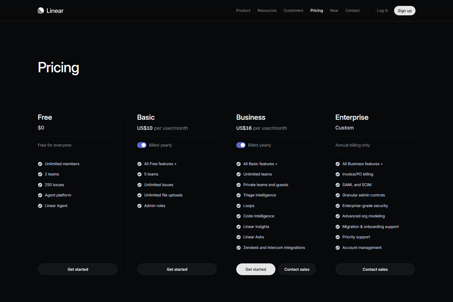
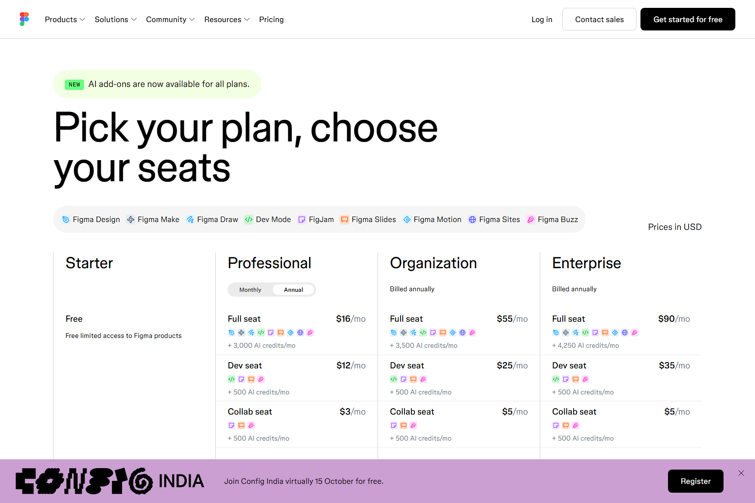
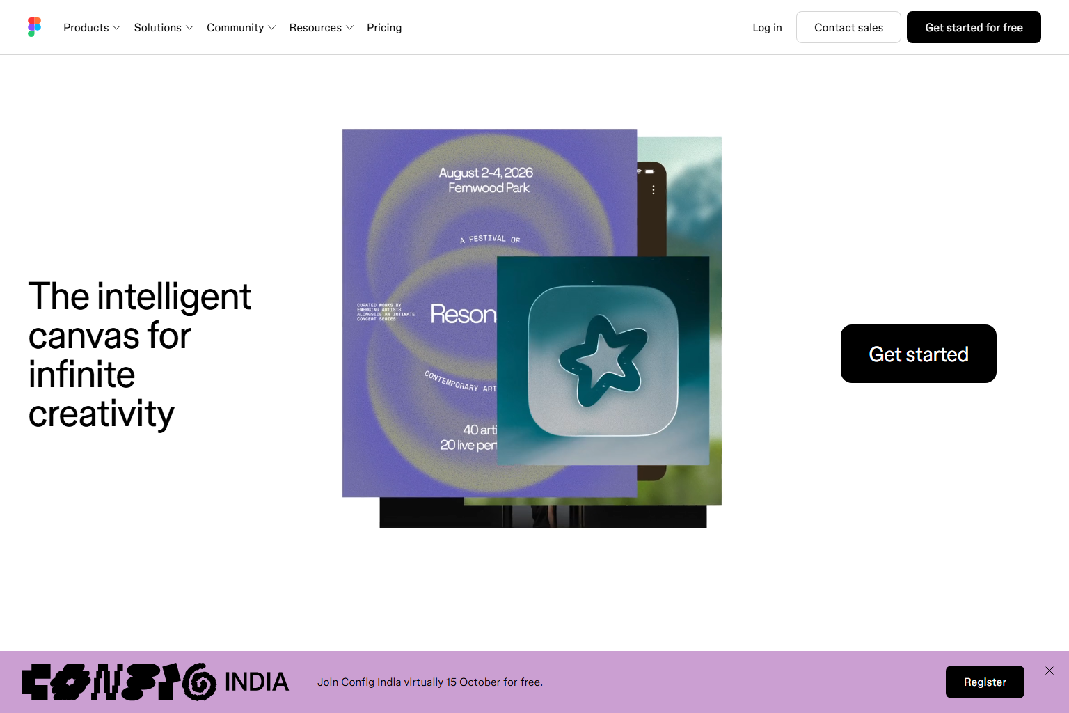
Captured from Figma, Linear
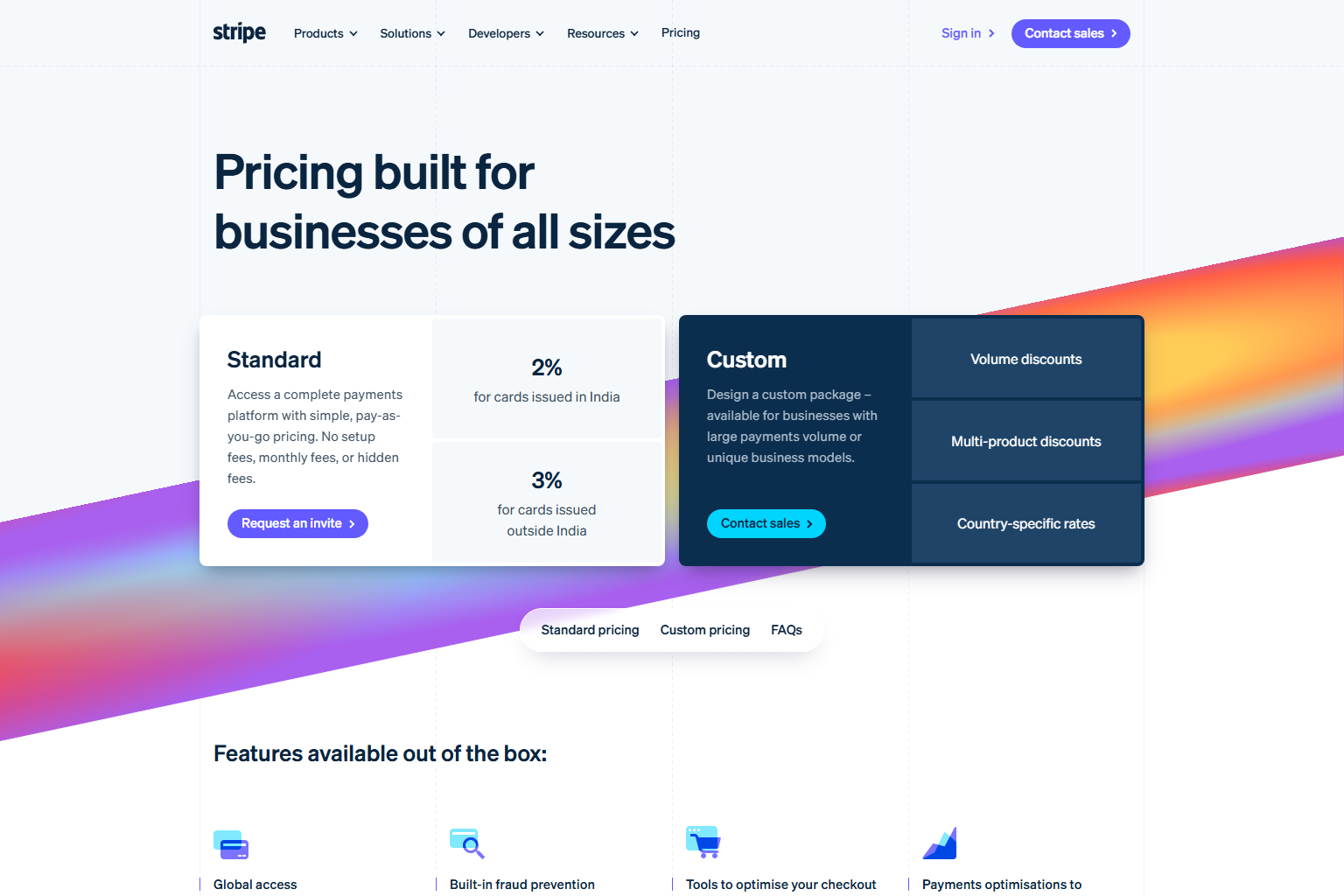
Trending in the library
View all screens
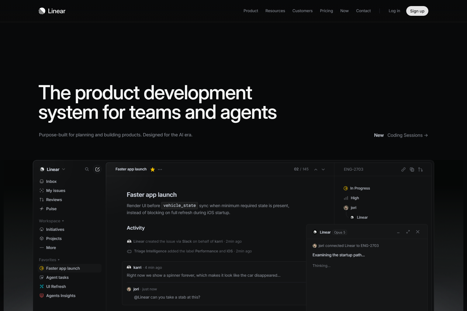
See a real flow in action
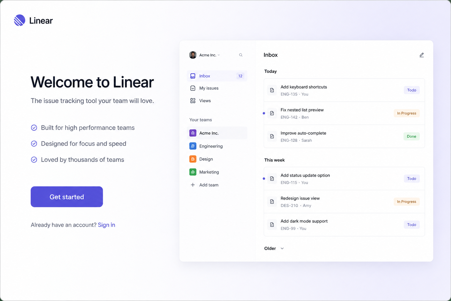
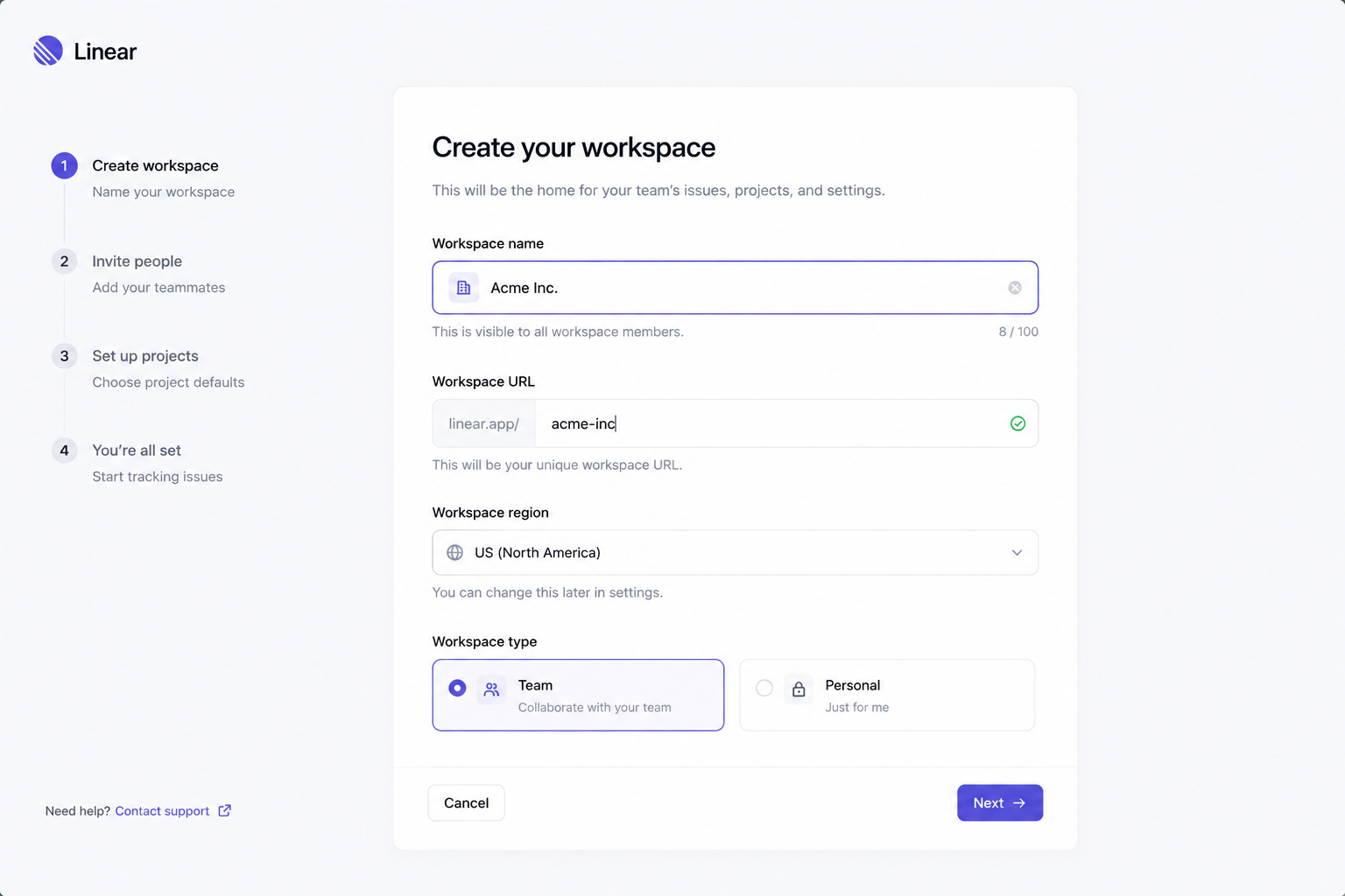
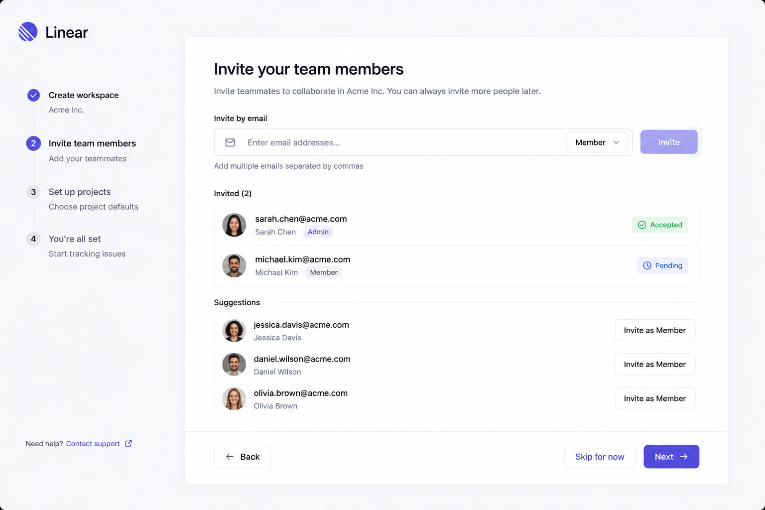
Workspace Onboarding Flow — Linear, step by step.
Step 1 of 3 · Linear — Welcome Screen
Screens
Every screen in the catalog is a real, verified capture from a live product page — not an illustrative mockup.
Components
A Component is a single, reusable interface element — a button, modal, data table, or nav bar — captured from a real, shipped product rather than drawn from scratch.



Start free. Upgrade when you're ready to ship.
Illustrative pricing — final numbers are confirmed before launch.
Free
Browse the catalog and evaluate patterns.
- Full catalog browsing
- Editorial guidance on every pattern
- Limited live previews
- Personal favorites
Pro
Most popularFor individuals shipping production UI.
- Everything in Free
- Premium source code & ZIP exports
- Complete flows + agent prompts
- Brand profiles & unlimited collections
Team
Shared projects and brand systems for teams.
- Everything in Pro
- Shared projects & collections
- Team brand profiles
- Centralized billing & member roles
Common questions
Your next interface starts here.
Find the right pattern, understand why it works, and build it your way.