
Mastering Dark Mode Dashboards: UI Component Examples & Strategy
August 19, 2026 · 19 min read · by Alex Morgan
Discover how to strategically implement dark mode in dashboard UI components, moving beyond aesthetics to enhance usability, accessibility, and user engagement for complex interfaces.
Quick answer
Effective dark mode dashboard UI component examples include desaturated data visualizations with high contrast labels, navigation elements with subtle depth, tables with faint row striping, and form inputs with clear focus states. These designs prioritize readability and reduce eye strain by using dark gray backgrounds, semantic color palettes, and careful attention to element elevation rather than simple color inversion, enhancing user experience in low-light conditions.
Key takeaways
- Dark mode implementation for dashboards is a strategic design decision, not just an aesthetic toggle, critical for enhancing usability and reducing eye strain.
- Effective dark mode requires a unique, semantic color system with reduced luminance and desaturated palettes, avoiding pure black backgrounds for primary surfaces.
- Key dashboard components like charts, tables, and navigation elements demand specific dark mode adaptations for contrast, hierarchy, and maintaining brand identity.
- Accessibility (WCAG 4.5:1 contrast) and clear state management are paramount in dark mode to ensure usability for all users.
- Leveraging modern design tools and UI frameworks with dark mode support streamlines implementation, ensuring scalability and consistency.
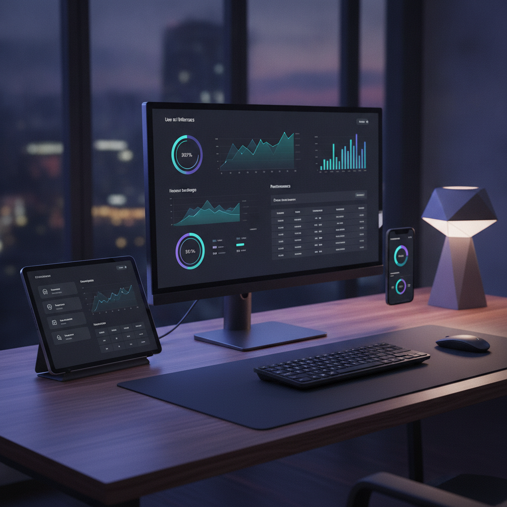
Dark mode dashboard UI component examples are specific visual elements within a dashboard interface, such as charts, tables, navigation menus, and input fields, designed with a dark color palette to reduce eye strain and improve visibility in low-light conditions, optimized for a cohesive user experience. Effectively implementing dark mode for dashboard components transcends mere aesthetic preference; it represents a strategic design decision that, when executed with precision, significantly enhances user engagement and operational efficiency, particularly for professionals monitoring data over extended periods or in varied lighting. As ThatDesignUI's UI/UX Design Editor, I (Alex Morgan) routinely dissect modern digital products to understand the nuances of interface patterns and interaction decisions. My research, particularly into complex data-rich applications, reveals that while dark mode is increasingly popular, its effective implementation for dashboard components presents unique challenges that many products fail to address, leading to suboptimal user experiences.
Dark Mode: A Strategic Imperative, Not Just an Aesthetic Toggle
The proliferation of dark mode across applications and operating systems is undeniable. Driven by user preference for reduced eye strain in low-light environments and potential battery savings on OLED screens (Source: Google I/O, 2018), dark mode has moved from a niche feature to a mainstream expectation. However, many implementations are superficial, merely inverting colors without considering the nuanced impact on data hierarchy, readability, and overall user experience. This often leads to a 'muddy' interface where content blurs, important elements recede, and critical data becomes harder to process, ultimately hindering productivity rather than enhancing it.
For a platform like ThatDesignUI, which focuses on providing high-quality UI inspiration and understanding strong interface patterns, recognizing the strategic depth of dark mode is paramount. It's not enough to simply offer a toggle; the design must be intentional, component-by-component, ensuring that the dark canvas serves to highlight information rather than obscure it. A well-designed dark mode can significantly improve user comfort, particularly for professionals who spend hours interacting with complex dashboards, such as data analysts, financial traders, or system administrators. Our goal is to equip designers and developers with the insights needed to transform dark mode from a mere option into a powerful tool for enhanced usability and engagement.
The challenge lies in balancing aesthetic appeal with functional integrity. A truly effective dark mode implementation for dashboards requires a deep understanding of contrast ratios, semantic color usage, and how different UI components interact within a dark environment. Neglecting these details not only frustrates users but also undermines the very purpose of a dashboard: to provide clear, actionable insights at a glance. By focusing on specific dark mode dashboard UI component examples, we can illustrate best practices and common pitfalls, guiding product teams toward superior interface solutions.
Core Principles for Dark Mode Component Design
Before diving into specific dark mode dashboard UI component examples, it's crucial to establish foundational principles that govern effective dark theme design. These principles ensure consistency, maintain readability, and enhance the overall user experience.
Reduced Luminance: The primary background should not be pure black (
#000000). Instead, use a dark gray (e.g.,#121212or#1E1E1E) to reduce eye fatigue and allow for true black accents for elevation. Pure black can create an uncomfortable contrast with white text.Semantic Color Usage: Colors should convey meaning and status, not just aesthetics. A sophisticated dark mode defines a new set of semantic colors that work harmoniously against the dark background. For instance, warning colors might be muted slightly to prevent jarring vibrancy.
Elevated Contrast: Text and essential UI elements must meet WCAG AA contrast ratio standards (at least 4.5:1 for normal text). This often means using lighter shades of the original brand colors for foreground elements, rather than direct inversions.
Depth and Hierarchy: Dark mode can leverage shadows and slight color variations to denote elevation and hierarchy more effectively than light mode. Lighter surfaces appear closer, while darker ones recede.
Desaturated Palettes: Highly saturated colors can vibrate against a dark background, causing discomfort. Desaturate primary and accent colors slightly to make them less intense and more pleasing in dark contexts.
State Management: Clearly define hover, active, disabled, and focus states for all interactive elements. These states often require subtle background shifts or outline changes in dark mode to remain distinguishable.
Adhering to these principles prevents the common pitfalls of dark mode implementations, such as low contrast, color vibrancy issues, and a lack of visual hierarchy. Designers must approach dark mode as a distinct design system, not merely a color overlay, ensuring every component is purpose-built for its new context.
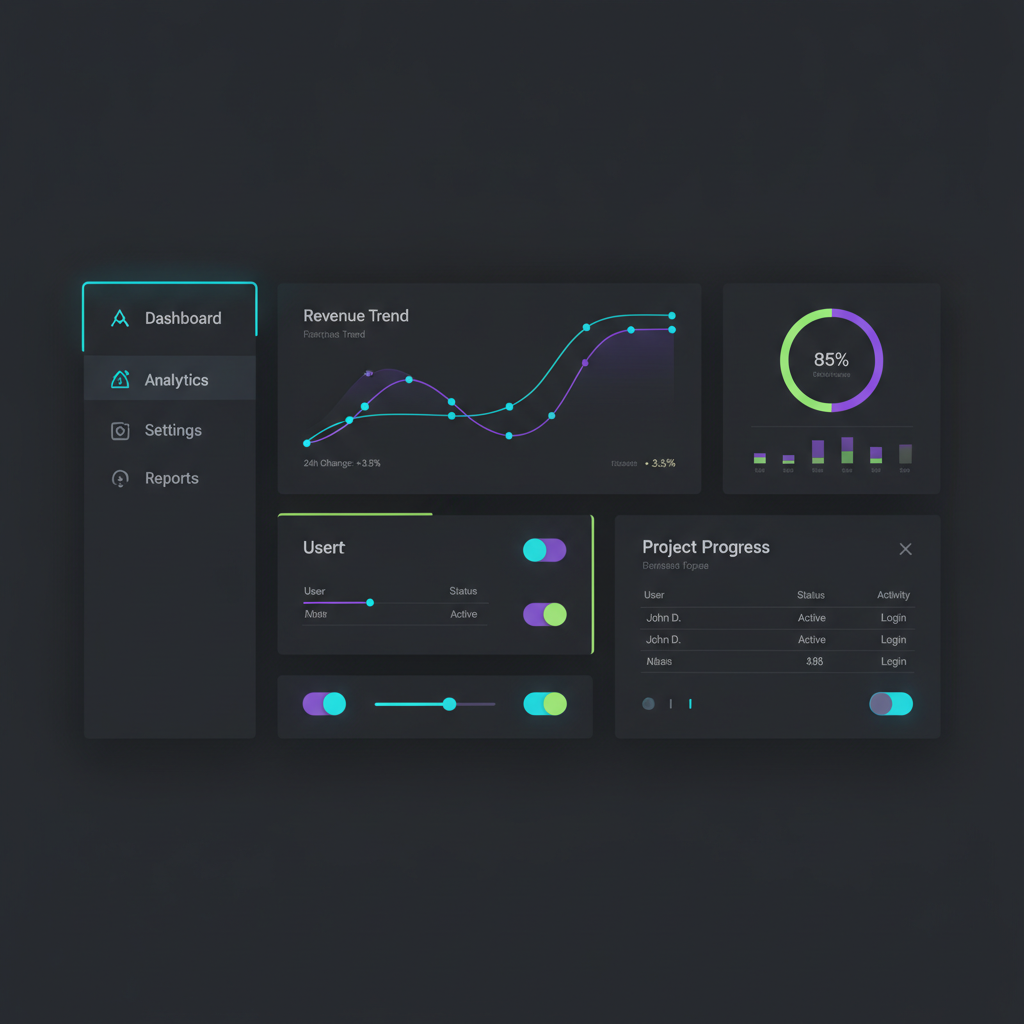
Essential Dark Mode Dashboard UI Component Examples
Let's explore specific dark mode dashboard UI component examples, detailing how to implement them effectively to maximize usability and visual appeal. Each component presents unique challenges and opportunities in a dark theme.
Data Visualization: Charts and Graphs
Data visualizations are often the heart of any dashboard. In dark mode, their legibility is paramount. The biggest challenge is ensuring that data series remain distinguishable without being overly bright or creating visual noise. Backgrounds for charts should be slightly lighter than the main dashboard background to provide a subtle container. Grids and axes should be soft and muted, not stark white. Data labels and legends need sufficient contrast without being blindingly bright.
Color Palettes: Utilize desaturated, yet distinct, color palettes. Avoid highly luminous colors that glow excessively. Consider using analogous or monochromatic schemes with varying luminance for related data sets. For example, a series of blues from light to deep indigo can work well.
Contrast and Readability: Ensure text labels, tooltips, and axis labels have a high contrast ratio against the dark background. A light gray or off-white is often more comfortable than pure white. Lines and shapes should be clear but not overpowering.
Interactive Elements: Hover states on data points should use a subtle glow or a slight increase in saturation, maintaining focus without distraction.
Backgrounds: Chart canvases should have a slightly elevated, darker background color (e.g.,
#222222) compared to the main dashboard background (e.g.,#1A1A1A). This provides visual separation and depth.
Navigation Elements: Sidebars and Headers
Navigation components guide users through the dashboard. In dark mode, their design must clearly delineate active states and maintain scannability without being overly distracting. Sidebars and headers typically serve as primary containers, and their dark mode implementation defines much of the dashboard's overall feel.
Elevation: Use a slightly different shade of dark gray for navigation backgrounds compared to the main content area. For example, a sidebar might be
#1C1C1Cwhile the main content is#1A1A1A, creating a subtle sense of depth.Active States: Highlight active navigation items with a subtle, lighter background color (e.g., a very light gray or a muted brand accent color) or a distinct left/bottom border. Text for active items should be slightly brighter or use the primary accent color.
Icons and Text: Ensure icons and navigation text are clearly visible. Lighter shades of gray or white work well. Consistent icon styling is crucial to avoid visual clutter.
Hover States: A slight background change or a soft border appears on hover, providing clear feedback without being disruptive.
Data Tables and Grids
Dashboards frequently present large amounts of tabular data. Ensuring readability and easy scanning in dark mode tables is crucial. Stripe patterns, cell borders, and text colors all need careful consideration.
Row Striping: Use very subtle variations in dark gray for alternating rows (e.g.,
#1A1A1Aand#1F1F1F) to improve readability and differentiate rows without creating harsh lines.Borders: Minimal, very faint borders (e.g.,
#333333) can help define cells without being visually heavy. Often, subtle background variations are preferred over strong borders.Text Color: Primary data text should be a legible light gray (e.g.,
#E0E0E0), while secondary information (e.g., metadata, units) can be a slightly darker light gray (e.g.,#A0A0A0).Headers: Table headers should have a slightly different background color (e.g.,
#222222) and bold, clearly visible text to distinguish them from data rows. Sort icons and filters must also maintain high contrast.
Form Inputs and Controls
Input fields, dropdowns, checkboxes, and radio buttons are fundamental for user interaction. Their dark mode design must clearly indicate their interactive nature, current state, and prompt for input.
Input Fields: Backgrounds for input fields should be a slightly lighter dark gray (e.g.,
#2C2C2C) than the surrounding area, with a subtle border (e.g.,#444444). Placeholder text should be a muted light gray.Focus States: A clear, typically branded, accent color border or glow around the focused input field is essential for accessibility and usability.
Checkboxes/Radio Buttons: Use a darker gray for the unchecked state and a prominent brand accent color for the checked state. The checkmark/dot itself should be white or a very light gray.
Dropdowns: Similar to input fields, with clear down arrows or indicators. Ensure the dropdown menu itself maintains consistent dark mode styling, with distinct hover and active states for options.
Cards and Widgets
Cards are versatile containers for information and functionality on dashboards. In dark mode, they help segment content and provide visual structure. The key is to use elevation effectively.
Elevation and Backgrounds: Cards should have a slightly lighter background color (e.g.,
#1E1E1Eor#222222) than the main dashboard background, and subtle shadows to create a sense of depth and separation. The shadow itself should be dark and diffused, not light.Content Contrast: All text, icons, and embedded components within the card must maintain excellent contrast against the card's background.
Borders: Minimal, soft borders can be used if shadows alone aren't enough to define the card's boundaries.
Interactive Cards: For cards that are clickable or draggable, distinct hover and active states are crucial, perhaps a slight background change or a subtle border highlight.
Notifications and Alerts
Notifications and alerts demand immediate attention. In dark mode, their design must be visually prominent without being overly aggressive or intrusive.
Semantic Colors: Use distinct but desaturated colors for different alert types (e.g., red for error, green for success, yellow for warning). These colors should be slightly muted compared to their light mode counterparts to avoid harshness on a dark background, but still clearly convey meaning.
Contrast: Ensure the alert text has high contrast against its colored background. Often, white or a very light gray text works best on these colored alert backgrounds.
Dismissal: The 'X' icon or 'Dismiss' button should be clearly visible and accessible.
Positioning: Whether inline or as a toast, notifications should respect the overall dark theme's visual hierarchy and not appear out of place.
Buttons and Action Elements
Buttons are critical for user interaction and submitting actions. Their states (default, hover, active, disabled) must be unambiguous in dark mode.
Primary Buttons: Should stand out with a solid brand accent color (desaturated for dark mode) or a strong, high-contrast background (e.g., a dark blue on a dark gray background). Text should be white or very light gray.
Secondary Buttons: Often have a transparent background with a colored border and text, or a very subtle dark gray background with colored text.
Ghost Buttons: Typically have a light gray border and text on a transparent background, ensuring they are still visible.
Disabled State: Mute the button's background and text significantly, using a very light gray or low-opacity version of the original color, making it clear the action is unavailable.
Hover/Active States: Implement clear visual feedback, such as a slight background color change, a subtle glow, or a border animation, ensuring users know their interaction is registered.
Modals and Dialogs
Modals and dialogs interrupt the user's workflow, so their presentation in dark mode needs to be clear and focused. They typically appear on top of a dimmed background.
Overlay: The background overlay behind the modal should be a very dark, semi-transparent color (e.g.,
rgba(0,0,0,0.7)) to dim the underlying content without completely obscuring it, maintaining context.Modal Background: The modal itself should have a distinct, slightly lighter dark gray background (e.g.,
#222222or#282828) than the main dashboard, and strong shadows to denote elevation.Content: All content within the modal (text, inputs, buttons) must follow the dark mode principles for high contrast and readability.
Close Button: A clearly visible 'X' icon or 'Close' text should be present, maintaining high contrast against the modal's background.
Why Is Dark Mode More Than Just Inverting Colors?
Simply inverting colors for dark mode is a common and often detrimental mistake. While it might seem like a quick solution, it typically results in a visually jarring and functionally inferior interface. This approach often leads to excessively bright text and UI elements against a pure black background, which can cause significant eye strain, especially for users with astigmatism (Source: American Academy of Ophthalmology, 2021). The human eye perceives light text on a dark background differently than dark text on a light background; the former can appear to 'bloom' or 'bleed', a phenomenon known as halation.
Furthermore, direct inversion ignores semantic color usage. A primary brand blue that looks crisp on a white background might become harsh and overwhelming when inverted on black. Iconography and illustrations designed for light mode often lose their intended meaning or become visually noisy when their colors are simply flipped. True dark mode design requires a thoughtful re-evaluation of the entire color system, focusing on luminance contrast, desaturation, and the intentional use of subtle dark grays to create depth and hierarchy. It's about crafting a harmonious visual experience that prioritizes readability and user comfort in a low-light context, rather than a superficial aesthetic change.
What Are the Accessibility Considerations for Dark Mode Dashboards?
Accessibility is a cornerstone of good UI design, and dark mode introduces its own set of challenges that must be meticulously addressed. The primary concern is ensuring sufficient contrast for all text and interactive elements. The Web Content Accessibility Guidelines (WCAG) recommend a minimum contrast ratio of 4.5:1 for normal text and 3:1 for large text (Source: WCAG 2.1 Guidelines). Meeting these standards in dark mode is crucial to prevent eye strain and ensure content is legible for users with low vision or color blindness.
Beyond contrast, designers must also consider the visual weight of colors. Highly saturated colors can be overwhelming or even cause discomfort for some users in dark mode. Desaturating colors slightly helps maintain a calmer visual environment. Focus indicators for interactive elements (buttons, input fields) must be clearly visible, often implemented with a bright, contrasting outline or glow. Moreover, ensure that information conveyed by color is also available through other means, such as text labels or patterns, to support users with color vision deficiencies. A robust dark mode design prioritizes clarity and usability for all users, not just those with perfect vision.
How Do You Maintain Brand Identity in Dark Mode?
Maintaining brand identity in dark mode is a nuanced challenge, as simply using the same brand colors often fails. A brand's primary color palette is typically optimized for a light background. When transitioning to dark mode, these colors might appear too vibrant, lose their distinctiveness, or clash with the darker environment. The solution lies in creating a secondary, dark-mode-specific color palette that retains the essence of the brand while adapting to the new context.
This involves desaturating primary brand colors slightly and adjusting their luminance. For example, a bright brand blue might become a deeper, more muted blue in dark mode, but still recognizably 'the brand's blue.' Logos and graphic elements may also need dark mode variations, perhaps with lighter outlines or adjusted fills to stand out against the dark background. Consistency in typography, iconography, and overall visual patterns (e.g., rounded corners, shadow styles) across both light and dark themes is equally important. The goal is to ensure that even with a different color scheme, the user immediately recognizes the product's unique visual language and feels a consistent brand experience, whether exploring the ThatDesignUI platform or engaging with another SaaS dashboard.
What Tools and Frameworks Aid Dark Mode Implementation?
Implementing a sophisticated dark mode across a complex dashboard UI requires robust tools and frameworks that streamline the process for designers and developers. Modern design tools like Figma, Sketch, and Adobe XD offer powerful features for creating and managing design systems with multiple themes. Using variables and component libraries allows designers to define color tokens for both light and dark modes, ensuring consistency and easy switching.
On the development side, UI frameworks and libraries provide built-in dark mode support or mechanisms for easy theming. Popular choices include: React (with libraries like Material-UI, Chakra UI, Ant Design, or Tailwind CSS with JIT mode), Vue.js (with Vuetify or Quasar), and Angular (with Angular Material). These frameworks typically offer utilities to define global themes, manage color palettes, and apply specific styles based on the user's preference or system settings. CSS variables (custom properties) are also indispensable for dynamic theming, allowing developers to define colors once and swap entire palettes with minimal code. Leveraging these tools not only accelerates development but also ensures a scalable and maintainable dark mode implementation, a critical consideration for any product team. You can explore more UI design insights on the ThatDesignUI blog for deeper dives into these tools.
For instance, Google's Material Design guidelines provide comprehensive recommendations and components specifically tailored for dark themes (Source: Material Design - Dark Theme), offering a strong starting point for any team. Similarly, Apple's Human Interface Guidelines detail considerations for dark mode on iOS and macOS. Adopting a well-documented design system or framework significantly reduces the overhead of implementing dark mode from scratch and helps enforce consistency across all UI components.
When Should You Prioritize Dark Mode for Your Users?
Deciding when to prioritize dark mode is a strategic business and design decision, not just a technical one. While popular, it's not universally beneficial. Dark mode should be a high priority if your target audience frequently uses your dashboard in low-light environments, such as late-night data analysis, monitoring systems in control rooms, or general casual browsing after hours. Studies suggest that 82% of users prefer dark mode when available (Source: Android Authority Poll, 2020), indicating a strong user demand that can impact satisfaction and retention.
Furthermore, applications with a high density of complex data visualizations or long-form content can particularly benefit from dark mode, as it can reduce perceived glare and improve focus. For SaaS products, offering dark mode can be a competitive differentiator, signaling a commitment to user comfort and modern design. Conversely, if your application is primarily used in bright office environments for short bursts of interaction, or if it relies heavily on vibrant, non-adaptable imagery, the effort might yield less significant returns. User research, including surveys and usage analytics, is essential to understand your specific audience's needs and preferences, ensuring development resources are allocated effectively for maximum impact.
Conclusion: Mastering the Dark Side of UI Design
The journey to mastering dark mode dashboard UI component examples is far more intricate than a simple color inversion. It demands a deep understanding of visual hierarchy, semantic color theory, and accessibility principles tailored for a darker canvas. From data visualizations that communicate clearly without glare to navigation elements that guide users seamlessly, each component requires thoughtful adaptation.
By embracing a strategic approach, product designers, developers, and SaaS teams can transform dark mode from a mere aesthetic option into a powerful tool for enhancing user comfort, improving data readability, and ultimately, boosting user engagement and productivity. The insights shared here, drawing from extensive UI/UX research, underscore that a well-executed dark mode is a testament to meticulous design, contributing significantly to a superior overall user experience. As the digital landscape continues to evolve, the ability to craft truly effective dark interfaces will remain a hallmark of exceptional product design.

Written by
Alex MorganUI/UX Design Editor
Alex researches modern digital products and breaks down the UI patterns, layouts, and interaction decisions that make great interfaces work. Alex focuses on practical inspiration for product designers, frontend developers, and SaaS teams.
Frequently asked questions
What is the primary benefit of dark mode for dashboards?
The primary benefit is reduced eye strain in low-light environments, which can improve user comfort and focus during extended use. It can also potentially save battery life on devices with OLED screens.
Why shouldn't I just invert my light mode colors for a dark theme?
Simply inverting colors often leads to poor contrast, oversaturated hues that are jarring on a dark background, and a loss of visual hierarchy. Effective dark mode requires a purpose-built color system and component design.
How can I ensure my dark mode dashboard is accessible?
Ensure all text and interactive elements meet WCAG contrast ratio standards (4.5:1 for normal text). Use desaturated colors, provide clear focus indicators, and ensure information conveyed by color is also available through other means.
What kind of background color is best for dark mode dashboards?
Instead of pure black (#000000), use a dark gray (e.g., #121212 or #1E1E1E). This reduces harsh contrast, allows for elevation through slightly lighter dark grays, and is generally more comfortable for the eyes.
How do I test the effectiveness of my dark mode implementation?
Conduct user testing in various lighting conditions to gather feedback on readability, comfort, and usability. Utilize accessibility tools to check contrast ratios and ensure compliance with WCAG guidelines across all components.